

Project Goals
The client had some basic branding that needed a refresh so we created a simple flat design of stacked rocks to accompany the existing logo. Three stacked rocks are synonymous with massage therapy and represent the three components of wellness: body, mind and soul. We also put together a fresh and calming colour palette of various muted greens, light blue and a bright avocado green to draw the user’s eye to the call-to-actions.
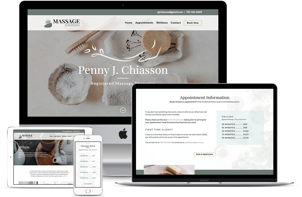
Updating the website design for a more cohesive look was an important part of the rebuild. Massage Solutions now has a branded colour palette and imagery that projects a sense of calm and healing and better reflects Penny and her business.
We reorganized the content to provide the user with easy access to information. We did this by moving the most important information near the top of the page and by using quick links to help users find information fast. We also updated the fitness page to a blog format to help with organization and to allow the client to continuously add content while still maintaining a clean and organized aesthetic.

